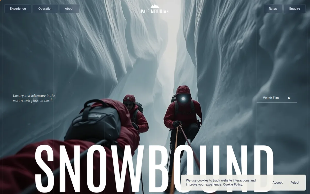
A luxury polar-expedition camp site built as one long descent into white. The hero is a pinned, scrubbed film still under a giant condensed word; scrolling blurs it, then a mist layer rises until the frame is pure white and the next section lands on cracked blue ice. Navy, glacier white and a single signal orange, with an italic serif for every human-scale line.
Rebuild: design-inspiration-rebuilds/hotel-restaurant/white-desert (fictional content, generated images, open-source fonts; installed with the optional design-inspiration-rebuilds skill). Run it with npm install && npm run dev.
Design Tokens
| Role | Value |
|---|---|
| Navy (footer wordmark, text) | #1e2a47 |
| Cream / mist (page, footer) | #f1f0ea / #e8e7e1 |
| Signal orange (CTA, side tab, cursor, active tab) | #ff7a14 |
| Route cyan (arc, dot) | #6fe3ff |
| Night (route section) | #0c0f17 |
:root {
  --ease: cubic-bezier(.65, .05, 0, 1);               /* card flick, UI transitions */
  --cond: 'Antonio', sans-serif;                      /* original: a tall condensed grotesque */
  --serif: 'Cormorant Garamond', serif;               /* italic for every quiet line */
  --sans: 'Inter', sans-serif;
}
.hero__word { font-size: 21vw; line-height: .86; font-weight: 600; }   /* the giant place name */
.cols { display: grid; grid-template-columns: repeat(6, 1fr); }        /* fixed hairline grid over everything */
- Type: three voices only. Condensed caps for the place name and footer wordmark (both span the full width), an italic serif for taglines, card titles and sub-labels, a neutral grotesk for body and UI. Never mixed within one line.
- Grid: six fixed 1px hairline columns sit above the whole page (
mix-blend-mode: difference), so the site feels drawn on graph paper even over photography. - Shape: 2px radii, frosted-glass pills over imagery, flat cream tiles in the footer, no shadows.
- Cursor: a 6px orange square replaces the pointer dot; a vertical orange "How it works" tab is pinned to the right edge.
Motion Spec
| What | Trigger | Animation | Duration / easing | Rebuild file |
|---|---|---|---|---|
| Smooth scroll | always | Lenis { lerp: .1, smoothWheel } on gsap.ticker, lagSmoothing(0) |
— | src/scroll.js |
| Load intro | page load | navy cover collapses with an ellipse clip-path, hero letters rise | 1.1s power3.inOut, letters 1.2s power4.out stagger .05 |
src/intro.js |
| Hero scrub | scroll through 260vh | image scale 1 → 1.3 + blur 10px, word drifts up per letter, mist rises to white, second image cross-fades | scrub .6, linear | src/hero.js |
| Tall parallax | section passes viewport | oversize image yPercent −11 → 11 | scrub | src/parallax.js |
| Camps gallery | pinned scroll | track translates horizontally, frames scale .9 → 1 near centre (containerAnimation) | scrub .6 | src/camps.js |
| Card flick | hover (touch: tap) | open card flex-grow 1 → 4, others blur 6px, text fades in after .4s | .9s cubic-bezier(.65,.05,0,1) |
src/flick.js |
| Route map | scroll through 320vh | SVG arc drawn by dashoffset, dot rides the path, stats count up | scrub .5 | src/route.js |
| Menu panel | click | clip-path inset reveal from the left, scrim blur, links rise | .8s power3.out, stagger .04 |
src/menu.js |
| Orange cursor | pointer move | quickTo follow |
.15s power3 |
src/cursor.js |
Key excerpts
Hero scrub (blur, mist, white-out): src/hero.js
const tl = gsap.timeline({
  scrollTrigger: { trigger: '#hero', start: 'top top', end: 'bottom bottom', scrub: 0.6 },
  defaults: { ease: 'none' },
});
tl.to('.hero__a', { scale: 1.3, filter: 'blur(10px)', duration: 0.45 }, 0)
  .to('.hero__b', { opacity: 1, duration: 0.4 }, 0.3)
  .fromTo('#mist', { opacity: 0, yPercent: 30 }, { opacity: 1, yPercent: -10, duration: 0.6 }, 0.2)
  .to('#word span', { yPercent: (i) => -12 - (i % 3) * 8, opacity: 0.35, duration: 0.45, stagger: 0.01 }, 0)
  .to('.hero__pin', { backgroundColor: '#fff', duration: 0.2 }, 0.8);
The hero is a 260vh track with a CSS position: sticky child, so no pin spacer is needed.
Horizontal camps gallery: src/camps.js
const dist = () => track.scrollWidth - innerWidth;
const tween = gsap.to(track, {
  x: () => -dist(), ease: 'none',
  scrollTrigger: { trigger: '#camps', start: 'top top', end: () => '+=' + dist(),
    pin: '.camps__pin', scrub: 0.6, invalidateOnRefresh: true, anticipatePin: 1 },
});
gsap.utils.toArray('.camp').forEach((c) =>
  gsap.fromTo(c, { scale: 0.9 }, { scale: 1, ease: 'none',
    scrollTrigger: { trigger: c, containerAnimation: tween, start: 'left 95%', end: 'left 40%', scrub: true } }));
Card flick (pure CSS expand): src/style.css
.card { flex: 1 1 0; min-width: 0; transition: flex-grow .9s var(--ease); }
.card.is-open { flex-grow: 4; }
.card__img { filter: blur(6px); transform: scale(1.06); transition: filter .9s var(--ease), transform .9s var(--ease); }
.card.is-open .card__img { filter: none; transform: none; }
.card.is-open .card__txt { opacity: 1; transition-delay: .4s; }
Route arc and counting stats: src/route.js
const len = arc.getTotalLength();
gsap.set(arc, { strokeDasharray: len, strokeDashoffset: len });
// ...
.to(st, { p: 1, ease: 'none', duration: 0.65,
  onUpdate() {
    arc.style.strokeDashoffset = len * (1 - st.p);
    const pt = arc.getPointAtLength(len * st.p);
    gsap.set([dot, pulse], { attr: { cx: pt.x, cy: pt.y } });
    stats.forEach((s) => (s.textContent = fmt[s.dataset.fmt](+s.dataset.n * st.p)));
  } }, 0.05)
prefers-reduced-motion: smooth scroll, intro and every scrubbed effect are skipped (the hero stays
a static still); the menu and card flick switch without transitions.
Why Award-Worthy
- One idea per scroll zone. Blur-to-white, horizontal ice gallery, expanding cards, drawn route: four distinct set pieces, each with a single clear mechanic and enough room to breathe.
- The white-out transition. The hero does not cut: a mist layer rises until the frame is pure white, which is exactly the product (the white desert) and the colour of the next section.
- A restrained palette with one hot accent. Navy and ice carry everything, orange appears only on action (Enquire, side tab, cursor, active tab), so it always reads as "click here".
- Typographic scale as brand. The place name and the footer wordmark are both full-bleed condensed caps; the italic serif keeps the voice human.
- Information as motion. Flight time and distance count up while the route is drawn, so the practical facts arrive as part of the story, not as a table.
Anti-patterns it avoids: no generic fade-up reveals; no carousels with arrows (the cards expand under the pointer); no cookie-banner-sized chrome over imagery beyond one small pill; no extra accent colours.
Credits
- Original: white-desert.com by Malvah. Design and content are the intellectual property of their creators.
- Recognition: Awwwards Site of the Day, Developer Award (2026).
- This study is an independent clean-room analysis. The rebuild uses a fictional expedition brand, AI-generated images and open-source fonts; it contains no original code, assets or copy.