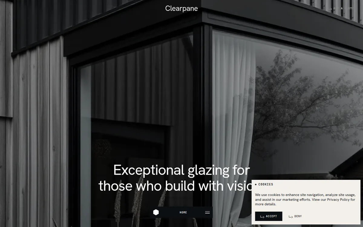
A bespoke-glazing company site that lets photography carry everything. A full-bleed hero image with one calm headline, a warm cream editorial middle, a scattered product collection whose cards drift at different speeds, and a dark showroom section where an inset image frame expands to the full viewport. No WebGL, no decoration: two typefaces, three colours, a fixed dock-style menu pill at the bottom centre.
Rebuild: design-inspiration-rebuilds/architecture/fluid-glass (fictional content, generated images, open-source fonts; installed with the optional design-inspiration-rebuilds skill). Run it with npm install && npm run dev.
Design Tokens
| Role | Value |
|---|---|
| Cream (page) | #f2efea |
| Charcoal (ink, dark sections) | #212325 |
| Near-black (buttons, dock, menu) | #0b0f12 |
| Hairline | rgba(33,35,37,.25) |
:root {
  --cream: #f2efea; --ink: #212325; --black: #0b0f12;
  --ease: cubic-bezier(.65,.05,0,1);
  --pad: 36px;                                 /* page gutter; hairline rules inset by the same */
}
- Type: a neo-grotesk (original: Aeonik Pro; substitute: Hanken Grotesk 400) for everything readable, a mono (original: Aeonik Mono; substitute: JetBrains Mono 500/700) for eyebrows and buttons only.
- Display:
57.6px,line-height: 1,letter-spacing: -.03em, centred, weight 400. Large type is regular weight, never bold; tightness does the work. - Mono labels:
10.8–12.6px,letter-spacing: .08–.1em, uppercase, led by a small diamond bullet (eyebrows) or a bent arrow glyph (buttons). - Shape: zero radii, no shadows. Buttons are flat near-black rectangles that invert to white on hover. Sections are separated by 1px hairlines, not boxes.
- Layout: product cards sit on a 12-column grid at deliberately uneven columns and offsets (cols 4, 6, 9 and 1); the empty space is part of the composition.
Motion Spec
| What | Trigger | Animation | Duration / easing | Rebuild file |
|---|---|---|---|---|
| Smooth scroll | always | Lenis { lerp: .1 } driven by gsap.ticker, lagSmoothing(0) |
— | src/scroll.js |
| Hero title | load | SplitText lines, each wrapped in an overflow mask, yPercent 110 → 0 |
1.2s expo.out, stagger .12 |
src/hero.js |
| Hero image | load, scroll | scale 1.12 → 1; then drifts yPercent 0 → 18 as the hero leaves, title fades |
2s power3.out; scrubbed |
src/hero.js |
| About statement | scroll | every word opacity .15 → 1, staggered across the block |
scrubbed, top 80% → bottom 55% |
src/reveals.js |
| Collection cards | enters at 88% | image clip-path: inset(100% 0 0 0) → inset(0), then label fades in |
1.3s power3.inOut |
src/reveals.js |
| Card parallax | scroll | each card translates ±data-speed / 2 px, different speed per card |
scrubbed | src/reveals.js |
| Card hover | hover | image scale 1 → 1.05 | 1.2s cubic-bezier(.65,.05,0,1) |
src/style.css |
| Showroom frame | scroll | clip-path: inset(12%) → inset(0) expands to full-bleed; second image crossfades in at 55% |
scrub 1 | src/showroom.js |
| Dock menu | click | pill toggles a full-screen panel that wipes up; links rise from masks; Lenis stops | .9s expo.inOut; links power4.out, stagger .06 |
src/menu.js |
| Buttons | hover | background and colour invert | .5s cubic-bezier(.65,.05,0,1) |
src/style.css |
Key excerpts
Hero title lines out of a mask: src/hero.js
SplitText.create(title, {
  type: 'lines', linesClass: 'line', autoSplit: true,
  onSplit(self) {
    self.lines.forEach((l) => { l.innerHTML = `<span style="display:block">${l.innerHTML}</span>`; });
    return gsap.from(self.lines.map((l) => l.firstChild),
      { yPercent: 110, duration: 1.2, ease: 'expo.out', stagger: 0.12, delay: 0.3 });
  },
});
autoSplit re-runs on resize and the returned tween is reverted and replayed correctly.
Word-by-word statement: src/reveals.js
p.innerHTML = p.textContent.trim().split(/\s+/)
  .map((w) => `<span class="w">${w}</span>`).join(' ');
// ...
gsap.to('.about__text .w', { opacity: 1, ease: 'none', stagger: 0.1,
  scrollTrigger: { trigger: p, start: 'top 80%', end: 'bottom 55%', scrub: true } });
Words start at .15 opacity in CSS; the scrub reads as a quiet highlight moving through the text.
Scattered cards: reveal plus parallax: src/reveals.js
gsap.fromTo(img, { clipPath: 'inset(100% 0 0 0)' }, { clipPath: 'inset(0% 0 0 0)',
  duration: 1.3, ease: 'power3.inOut',
  scrollTrigger: { trigger: card, start: 'top 88%', once: true } });
const speed = +card.dataset.speed;                  // px, signed: -90 / 60 / -40 / 0
if (speed) gsap.fromTo(card, { y: -speed / 2 }, { y: speed / 2, ease: 'none',
  scrollTrigger: { trigger: card, start: 'top bottom', end: 'bottom top', scrub: true } });
The reveal sits on the image wrapper and the parallax on the card, so the two never fight over transform.
Expanding showroom frame: src/showroom.js
// CSS: .showroom__frame { clip-path: inset(var(--inset, 12%) var(--inset, 12%)); }
const tl = gsap.timeline({ defaults: { ease: 'none' },
  scrollTrigger: { trigger: '.showroom__stage', start: 'top 85%', end: 'bottom 40%', scrub: 1 } });
tl.fromTo(frame, { '--inset': '12%' }, { '--inset': '0%', duration: 1 })
  .fromTo('.showroom__frame .s2', { opacity: 0 }, { opacity: 1, duration: 0.5 }, 0.55);
Animating a CSS custom property keeps one clip-path rule in the stylesheet and one number in JS.
Dock menu wipe: src/menu.js
gsap.set(menu, { visibility: 'visible' });
gsap.to(menu, { clipPath: 'inset(0% 0 0 0)', duration: 0.9, ease: 'expo.inOut' });
gsap.fromTo(links.map((l) => l.firstChild), { yPercent: 110 },
  { yPercent: 0, duration: 1, ease: 'power4.out', stagger: 0.06, delay: 0.35 });
lenis?.[v ? 'stop' : 'start']();                    // freeze page scroll while open
prefers-reduced-motion: smooth scroll, reveals, scrubs and the frame expansion are disabled;
all content is visible.
Why Award-Worthy
- Photography is the design. The hero, cards and showroom are all full images with almost no chrome; type and layout only frame them. The site is quiet enough that the product reads.
- Restraint in the palette. Cream, charcoal, near-black, white. No accent colour at all; warmth comes from the cream and from the photos.
- Scattered grid with parallax. Four cards at uneven columns and offsets, each drifting at its own speed, give an editorial rhythm without a carousel or a pinned section.
- A single expanding frame. The showroom image grows from an inset window to full-bleed, turning an ordinary contact section into the page's finale.
- Fixed dock menu. A small bottom-centre pill replaces a header nav, keeping the top of the page free for the logo and one CTA, and giving thumbs a reachable target on mobile.
Anti-patterns it avoids: no hero carousel; no gradients, shadows or rounded cards; no animation on every element — only the headline, the statement and the cards move; the mono face is kept to labels so body copy stays legible.
Credits
- Original: fluid.glass by Exo Ape. Design and content are the intellectual property of their creators.
- Recognition: Awwwards Site of the Day, Developer Award.
- This study is an independent clean-room analysis. The rebuild uses a fictional company, AI-generated images and open-source fonts; it contains no original code, assets or copy.