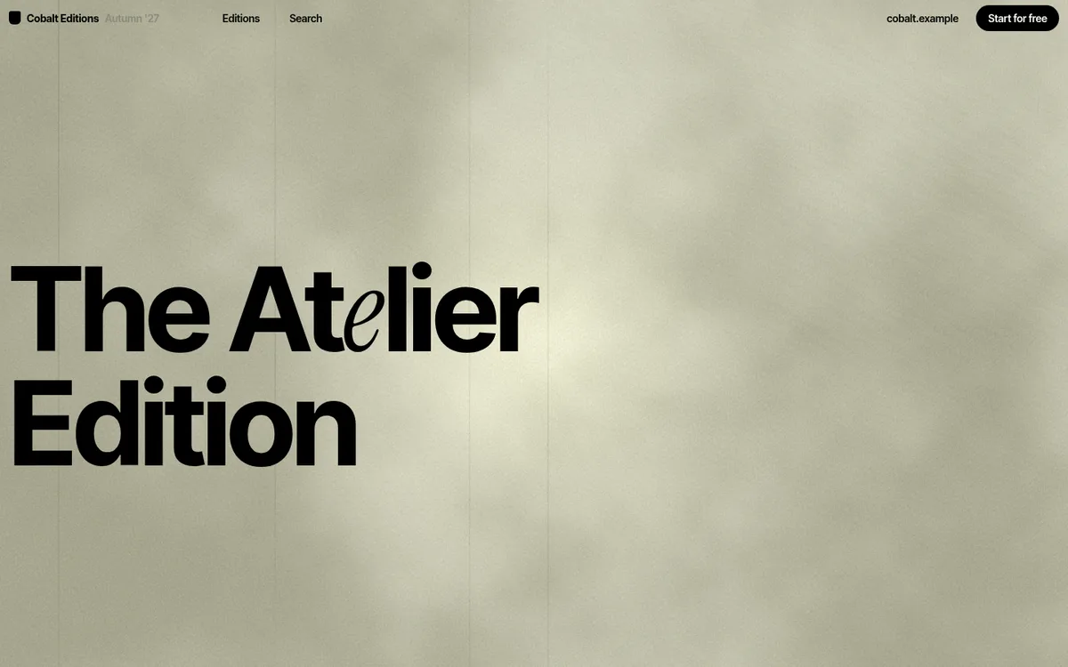
A product-release microsite that behaves like a printed catalogue. One fixed paper panel (a WebGL grain texture) holds the edition title and a roman-numeral chapter index; twelve chapters scroll past on a cream sheet beside it. The hero is just that panel at full width, shrinking into the sidebar as you scroll. No imagery in the hero, no colour beyond paper, ink and one grey.
Rebuild: design-inspiration-rebuilds/e-commerce/renaissance-edition (fictional content, generated images, open-source fonts; installed with the optional design-inspiration-rebuilds skill). Run it with npm install && npm run dev.
Design Tokens
| Role | Value |
|---|---|
| Page paper (body, behind panel) | #dcdcd0 |
| Content sheet | #f7f7ee |
| Ink | #000 |
| Muted grey (inactive index, descriptions) | #8a8a7c |
| Panel paper (shader range) | #adac95 → #d6d6c2 |
:root {
  --paper: #dcdcd0; --cream: #f7f7ee; --ink: #000; --mute: #8a8a7c;
  --pw: 100vw;                      /* panel width, scrubbed 100vw -> 20vw */
  --ease: cubic-bezier(.22, 1, .36, 1);
}
- Type: a neo-grotesk (original: Neue Montreal; substitute: Inter Tight) at 600-700, tight
tracking (
-.03em), small and dense. Feature text is 14px / 1.1; section leads are 32px / .95. A single italic serif glyph (substitute: Instrument Serif) is swapped into the title for one letter. - Layout: a 20vw fixed sidebar plus a content column; feature rows are a two-up grid of
title | muted description. Chapter titles are huge (up to ~150px,-.06em). - Shape: 6px image radius, a single black pill CTA, no shadows, no borders.
Motion Spec
| What | Trigger | Animation | Duration / easing | Rebuild file |
|---|---|---|---|---|
| Smooth scroll | always | Lenis { lerp: .1 } on the GSAP ticker, lagSmoothing(0) |
— | src/scroll.js |
| Paper shader | always, cursor | fbm mottling + grain + scratches; soft light follows the pointer | continuous, pointer lerp .06 | src/paper.js |
| Hero → sidebar | scroll 0 → 100vh | panel width 100vw → 20vw, title 190px → 32px, chapter list fades in | scrubbed, linear | src/hero.js |
| Chapter index | section crosses 50% | active link turns black and grows a dotted leader | .4s colour | src/chapters.js |
| Feature rows | enters at 90% | opacity 0 → 1, y: 14 → 0, description darkens |
.9s power3.out |
src/chapters.js |
| Chapter image | scroll | inner image scale 1.12 → 1 | scrubbed | src/chapters.js |
| Index jump | link click | Lenis scrollTo the chapter |
1.4s | src/chapters.js |
Key excerpts
Hero shrinks into the sidebar: src/hero.js
gsap.set('#title', { fontSize: big, top: '38vh' });
const tl = gsap.timeline({ defaults: { ease: 'none' },
  scrollTrigger: { trigger: '#spacer', start: 'top top', end: 'bottom top', scrub: true } });
tl.to(':root', { '--pw': '20vw' }, 0).to('#title', { fontSize: 32, top: 62 }, 0)
  .to(['#toc', '.panel__foot'], { opacity: 1, duration: .3 }, .7);
One CSS variable drives the panel width, so the canvas, title and layout stay in step.
Smooth scroll on the GSAP ticker: src/scroll.js
lenis = new Lenis({ lerp: 0.1, smoothWheel: true, autoRaf: false });
lenis.on('scroll', ScrollTrigger.update);
// ...
gsap.ticker.lagSmoothing(0);
gsap.ticker.add((t) => { lenis?.raf(t * 1000); frame.forEach((fn) => fn(t)); });
Paper shader: src/paper.js
float m = fbm(p*2.2 + uTime*.01);
vec3 col = mix(vec3(.678,.676,.584), vec3(.84,.84,.76), smoothstep(.25,.75,m));
col -= .06 * h(vUv*uRes + fract(uTime));                       // grain
// ...
col += vec3(.95,.92,.8) * exp(-d*d/(.22*.22)) * .16;            // cursor light
Active chapter in the index: src/chapters.js
chapters.forEach((c) => ScrollTrigger.create({ trigger: '#' + c.id, start: 'top 50%', end: 'bottom 50%',
  toggleClass: { targets: toc.querySelector(`[data-id=${c.id}]`), className: 'on' } }));
Row reveal: src/chapters.js
gsap.fromTo(r, { opacity: 0, y: 14 }, { opacity: 1, y: 0, duration: .9, ease: 'power3.out',
  scrollTrigger: { trigger: r, start: 'top 90%', once: true, onEnter: () => r.classList.add('in') } });
prefers-reduced-motion: smooth scroll and the hero scrub are off, the panel starts at sidebar
width and rows are visible immediately.
Why Award-Worthy
- A catalogue, not a landing page. The sticky roman-numeral index makes a 54,000px page feel navigable and finite, like a table of contents.
- One texture carries the brand. The paper shader is the hero, the sidebar and the mood; nothing else needs decoration.
- Restraint with density. Dozens of features stay readable through one small type size, one grey, and a two-column rhythm.
- A hero that becomes the UI. The opening frame doesn't disappear, it shrinks into the permanent navigation.
- Quiet motion. Linear scrubs and short, soft reveals; nothing bounces.
Anti-patterns it avoids: no carousel, no card shadows, no gradient backgrounds, no autoplay video, no decorative colour; the WebGL layer never blocks reading.
Credits
- Original: shopify.com/editions/winter2026 by Shopify Design. Design and content are the intellectual property of their creators.
- Recognition: Awwwards Site of the Month (Feb 2026), Site of the Day.
- This study is an independent clean-room analysis. The rebuild uses a fictional platform, AI-generated images and open-source fonts; it contains no original code, assets or copy.