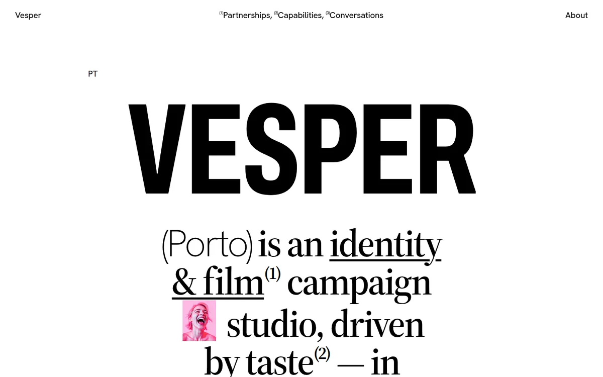
A one-screen studio site that is almost entirely typography: a giant condensed wordmark, then a bold serif statement in which two words are replaced by small photo thumbnails that hard-cut through images. White page, black ink, no accent colour. The only colour on the page comes from the images themselves.
Rebuild: design-inspiration-rebuilds/art-illustration/watson (fictional content, generated images, open-source fonts; installed with the optional design-inspiration-rebuilds skill). Run it with npm install && npm run dev.
Design Tokens
| Role | Value |
|---|---|
| Ink | #000 |
| Page | #fff |
| Image placeholder | #e5e1dc / #f1d6c8 |
:root { --ink:#000; --bg:#fff; --ease:cubic-bezier(.16,1,.3,1); --pad:2.5vw; }
html { font-size: clamp(14px, 1.35vw, 22px); }   /* everything in rem, scales with viewport */
- Wordmark: condensed grotesk (original: a custom condensed; substitute: Anton),
22vw,line-height: .9,letter-spacing: -.018em. Original computes about 320px at 1440 with-5.8pxtracking. - Statement: bold serif (substitute: Source Serif 4 600) at
6.4vw,line-height: 1.02,letter-spacing: -.035em, centred,text-wrap: balance. Key words are underlined and carry small superscript footnote numbers(1). The place name(Los Angeles)is set in a hairline grotesk (weight 200), a deliberate weight contrast inside the same sentence. - UI text: one grotesk at 400, about 19.5px,
-0.01em. Nav is three centred links with superscript indices, brand left, "About" right. - Layout: the footer is a 4-column grid: award photo (grayscale), then "(Recently)" and "(Contact)" columns. Parenthesised labels are the only decoration.
Motion Spec
| What | Trigger | Animation | Duration / easing | Rebuild file |
|---|---|---|---|---|
| Smooth scroll | always | Lenis { lerp: .1 } on the gsap ticker, lagSmoothing(0) |
— | src/main.js |
| Wordmark letters | load | each letter in an overflow:hidden mask rises from yPercent: 105 |
1.1s power4.out, stagger .07 |
src/intro.js |
| Nav and city label | load | opacity 0 → 1 after the letters | .8s, delay .7, stagger .1 | src/intro.js |
| Statement | load | yPercent: 18 → 0, opacity 0 → 1 |
1.2s power3.out, delay .5 |
src/intro.js |
| Wordmark drift | scroll | letters move up by -8 - i*3 %, so they fan out |
scrubbed | src/intro.js |
| Inline thumbnails | always | instant opacity cut through 4 images per slot, no crossfade | 1.3s / 1.7s interval | src/thumbs.js |
| Footer reveal | enters at 80% | columns slide up 40px and fade | 1s power3.out, stagger .12 |
src/intro.js |
Key excerpts
Letter masks: src/intro.js
gsap.from('.ltr', { yPercent: 105, duration: 1.1, ease: 'power4.out', stagger: 0.07, delay: 0.1 });
// ...
gsap.to('.ltr', {
  yPercent: (i) => -8 - i * 3, ease: 'none',
  scrollTrigger: { trigger: '.hero', start: 'top top', end: 'bottom top', scrub: true },
});
Hard-cut thumbnails: src/thumbs.js
setInterval(() => {
  imgs[n].classList.remove('on'); n = (n + 1) % imgs.length; imgs[n].classList.add('on');
}, k ? 1700 : 1300);
Two slots with different intervals never cut in sync, which keeps the sentence feeling alive.
Smooth scroll on the GSAP ticker: src/main.js
const lenis = new Lenis({ lerp: 0.1, autoRaf: false });
lenis.on('scroll', ScrollTrigger.update);
gsap.ticker.lagSmoothing(0);
gsap.ticker.add((t) => lenis.raf(t * 1000));
Inline thumbnail box: src/style.css
.thumb { display:inline-block; width:1.05em; height:1.2em; vertical-align:-.12em;
  background:#e5e1dc; overflow:hidden; margin:0 .1em; }
.thumb img { position:absolute; inset:0; object-fit:cover; opacity:0; }
.thumb img.on { opacity:1; }
Sizing the box in em makes the picture behave like a glyph inside the serif line.
prefers-reduced-motion: Lenis, intro and drift are skipped; thumbnails stay on the first image.
Why Award-Worthy
- Type as the whole interface. One wordmark and one sentence carry the entire first screen.
- Images as punctuation. Thumbnails sit inside the sentence at glyph size, so work is shown without a grid or a gallery.
- Weight contrast in one line. Hairline grotesk, bold serif and condensed display meet in a single composition without clashing, because colour never competes.
- Restraint. No accent colour, no shadows, no cursor effects; motion is limited to masks and a cut.
- Parenthesis and footnote system.
(1),(2),(Contact)give a consistent editorial voice.
Anti-patterns it avoids: no hero video, no carousel, no gradient, no generic fade-up on every element, no oversized menu overlay.
Credits
- Original: watson.la by Watson Design Group. Design and content are the intellectual property of their creators.
- Recognition: Awwwards Site of the Month (Sep 2024), Site of the Day.
- This study is an independent clean-room analysis. The rebuild uses a fictional studio, AI-generated images and open-source fonts; it contains no original code, assets or copy.